UX
Sunsketcher
Sunsketcher is the second iteration of a mobile app funded by NASA as part of an effort to collect data for scientists to study the shape of the sun. As a part of the Interface Design and Experience Analysis lab, I worked with a team of students and faculty at Western Kentucky University to design and test the mobile application. My primary role on this team was user testing.

The Problem?
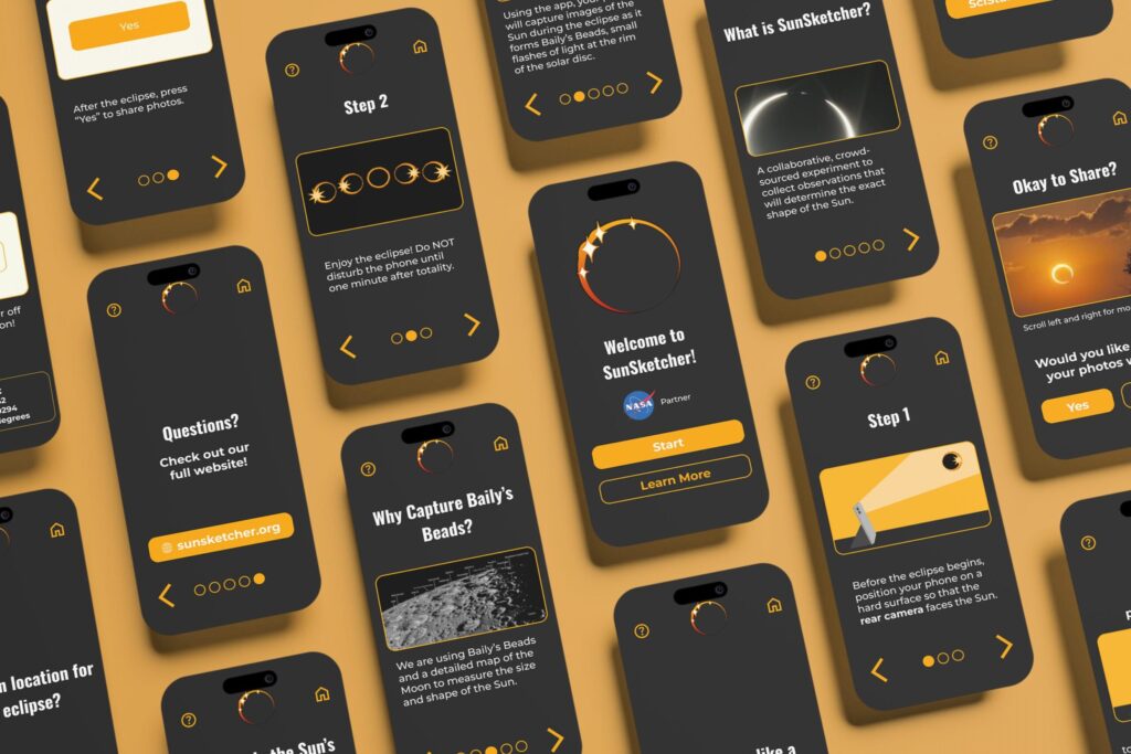
The main purpose of the Sunsketcher app is to help citizen scientists take photographs of a solar eclipse. These photos would be collected by NASA scientists to study the shape of the sun. Our primary tasks were to improve the tutorial for taking photos, better explain the purpose of the app for users with a less scientific background, and update the visuals.
The Solution.

Testing Data
86
Average System Usability Scale Score
92.7%
Average Task Success Rate
simplistic, effective, accessible, & organized
Product Reaction Cards
Goodreads
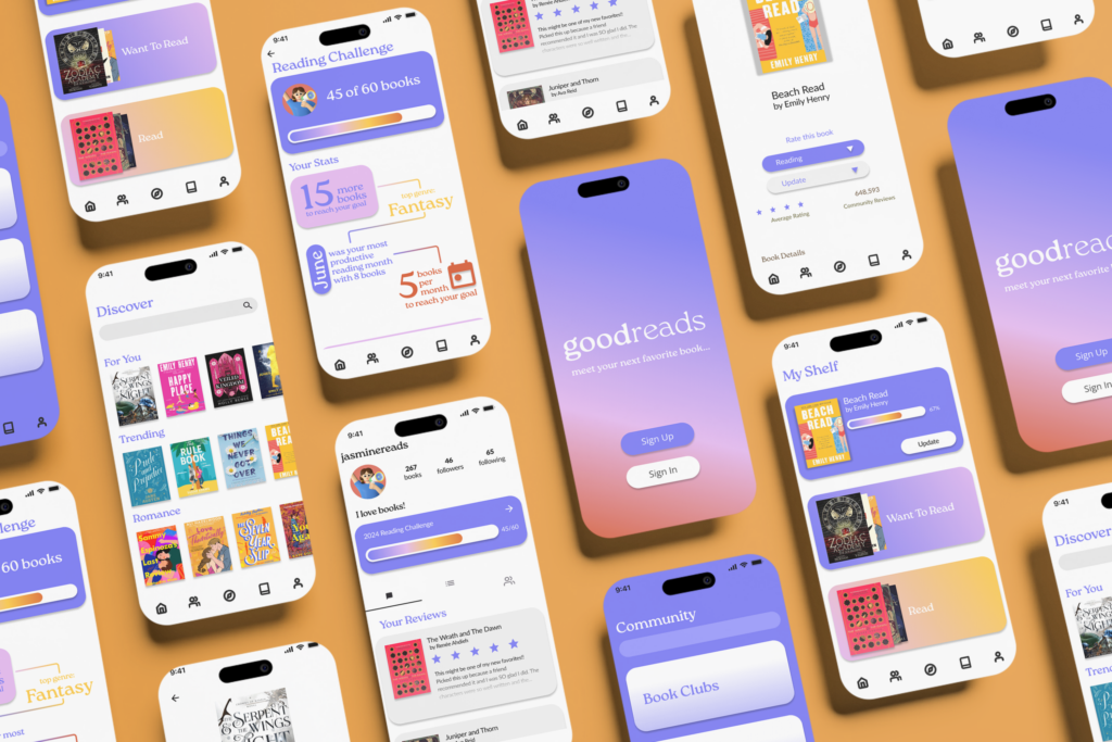
This project is a conceptual redesign of the Goodreads mobile app. Currently, the app’s UI is outdated and dull, with complicated user flows that “hide” some of the app’s best and most important features. For this project, I wanted to reimagine the app to best accommodate users. Not only was the user flow improved, but the overall visual identity was updated.
The Problem?
The current Goodreads mobile app interface is dull, full of complex user flows that hide key community features, and leave users feeling frustrated. Along with usability issues, the apps branding and identity needed an update. As user of the app, I saw a problem that needed to be addressed.
The User?
Goodreads users are both avid readers and individuals looking to form better reading habits. Users are likely social and community-driven individuals that value the discussion and sharing features that Goodreads provide. However, the current user flow buries some of the best community features that its key users value.
Target demographics are predominantly female (but not exclusive) and likely between the ages of 18-35.
The Solution.

Barbee Dental: Digitizing the Dental Experience for Kids
Spring 2026 • Team Members: Samantha Tinsley, Aaron Elliott, Eric Harrison
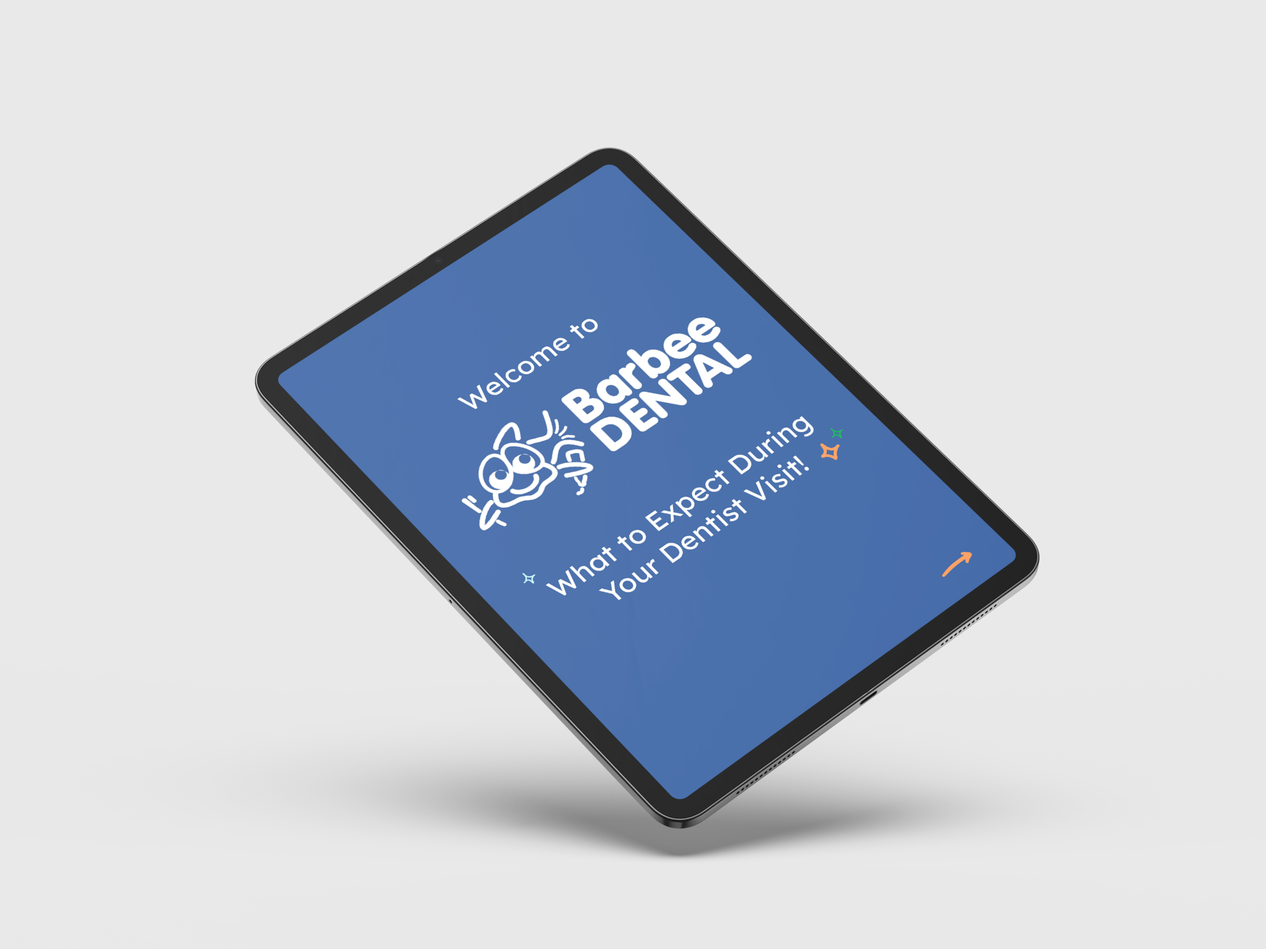
The Barbee Dental digital book was created as a more accessible and interactive way to familiarize children with what to expect during a dentist visit.

The Problem?
A local pediatric dentistry, Barbee Dental, serves children of varying ages and needs. They see a lot of young patients that are unfamiliar with the dentist’s office. Because many of the children they see have special needs, having a basic understanding of what they will experience at the dentist can help calm their nerves. Barbee Dental has an existing, physical book that shows children what to expect. However, these books are expensive to print, not accessible to all, and needed to be designed in a more child-friendly format.
Objectives
The objective of this project was to redesign and digitize the current book for children to access online. My team focused on accessibility, redesigning the visual identity for children, and adding interactive elements to create the best experience.
Research
Our research focused on children’s preferences for typography, colors, and platforms/devices. We researched specific UX/UI choices that are preferable to children.
Typography:
• Easy to read fonts
• No smaller than 14pt
• 1 or 2 font choices
• Rounded, sans-serif
Colors
• Oranges
• Blues
• Lilacs
Platforms
- Tablet
- Phone
- Mobile App
Our biggest challenges were that we could not test on our target user, as children are a vulnerable population and that the physical/cognitive capabilities of children change rapidly as they age. We had to design something usable for many ages of children, who possess varying capabilities, as well as something that could be used by parents to show to their children.
Personas

Nicholas Henderson
Age: 34
Occupation: High school teacher, father of six year old daughter
User Story: As a father, I want to make the dentist as painless as possible for my daughter. I want her to feel comfortable and familiar so that she gets over her fear of the dentist. When she is comfortable, the dentist and hygienists are also able to do their job easier.
Pain Points: Daughter gets incredibly anxious going to the dentist.

Kyle Jackson
Age: 8
Occupation: Student
Pain Points: Hates going to the dentist and doesn’t like being in unfamiliar environments.
User Story: I know I have to go to the dentist to get my teeth cleaned, but I never know what is going to happen when I get there. They use a lot of tools and I don’t know what they are for. I want to know more about the office I have to visit.
User Flow
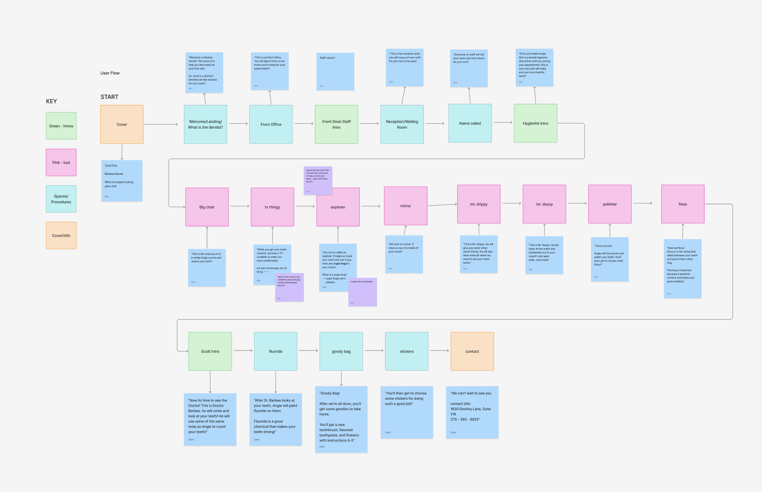
Based on the existing book, our team restructured the user flow of each page to better fit the experience a child has at the dentist office. We also edited and condensed the text for each page during this stage of planning and research.
Wireframing
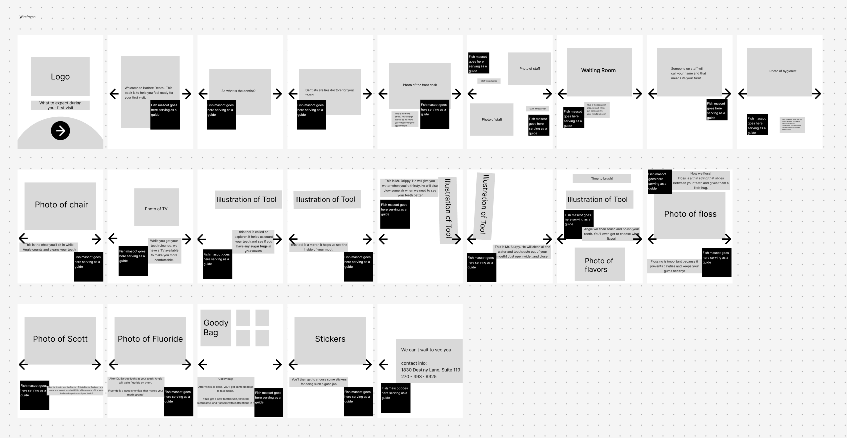
Our initial wireframes for general page layout.
Final Iteration